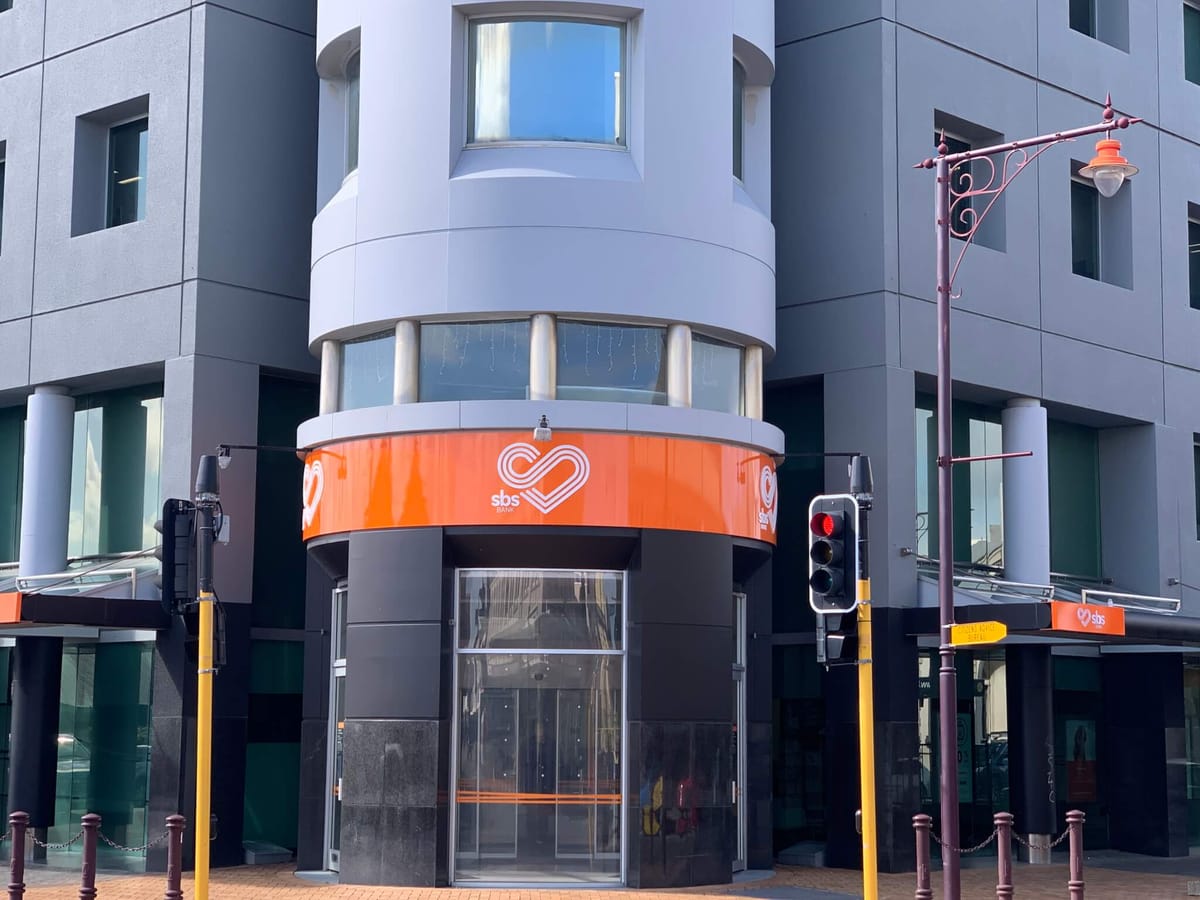
It has only been four years since Southland bank SBS last underwent a rebrand, but the signwriters are back to work once more. As of Saturday, a new logo on an orange background has replaced the old branding of the main branch in Invercargill on Don Street.
The fresh logo is in the shape of a heart, which signifies the bank’s desire to put the heart back into New Zealand banking. SBS prides itself on doing a lot for communities, which includes not sending its profits off-shore.
The previous rebrand, which took place in 2015, was effective in bringing SBS a step forward. However, the new branding with grey and orange as the two prominent colours is thought to be a better reflection of its people.
SBS Bank CEO Shaun Drylie said the brand portrays Southland’s vibrancy and the bank’s energy far better.
“Banking is more than just numbers, it’s about people,” he said.
SBS has a longstanding history in New Zealand, having established itself nationwide since 1869.

